Happy Friday, friends! I am heading home to Texas in TWO weeks, and since I haven’t been home since MARCH, you can bet that I am counting down every second. (I can’t wait to snuggle my sweet Sophie!) Before we get there though, I am heading into my last two busy weekends of 2018. I am so excited to have a chance to work with some super sweet couples! Keep your fingers crossed that we don’t have any snow tomorrow and into Sunday so I’ll be able to get back to DC safely!
If you’ve been following along, you know that I released a brand new site last week! I had so many people reach out with sweet words of encouragement, and I just wanted to let you know how much that means to me. Last week, I did a post all about the part of the rebrand that you may not necessarily see on the surface. (Find it here!) You see, this rebrand was SO much more than just the pretty that you are seeing here on the site!
BUT, I also had SO many people ask questions about the part of the rebrand that you CAN see, and today? We’re going all through them! From timelines to financials, the personal side of the rebrand, designs, and a little bit of everything in between… we’re diving into it ALL! This post got really long, really fast and is filled with lots of goodness, so let’s get started!
How long did it take from start to finish?
I started the rebranding process at about 1AM on October 17th! After wrapping up at KJ‘s workshop, I was feeling all kinds of inspired. I had been dreaming of rebranding for about 6 months at that point and literally already had researched everything that I wanted! I was just waiting until the exact second that I felt the push to put it all into practice! Well… the workshop was just what I needed! That night, my sweet friend Rachael and I stayed up until the wee hours of the morning, dreaming all about the project. I later released the site on November 26 after many days and late nights of hard work!
I just want to be clear and say that I don’t think I would ever recommend a timeline for a rebrand that looks like this one! It was a QUICK turnaround, and if I’m being honest, it was a little (OK… it was REALLY) stressful! I do have experience with web design, and I knew my goal and vision. I also knew that I wanted the site to be published as soon as it possibly could go live, preferably before the holidays & proposal season! If I could recommend anything, I would definitely suggest a rebrand timeline that is closer to 2-4 months if you are doing it yourself!
I have to say that, when I wasn’t shooting weddings, teaching or editing, I was working on the site. Sleep was minimal and so was personal time! If I had to estimate, I spent close to 250 or 300 hours working on the rebranding process.
Also, with all that being said, the site still isn’t completely done! There are plenty of tweaks and changes that will be happening in the future!

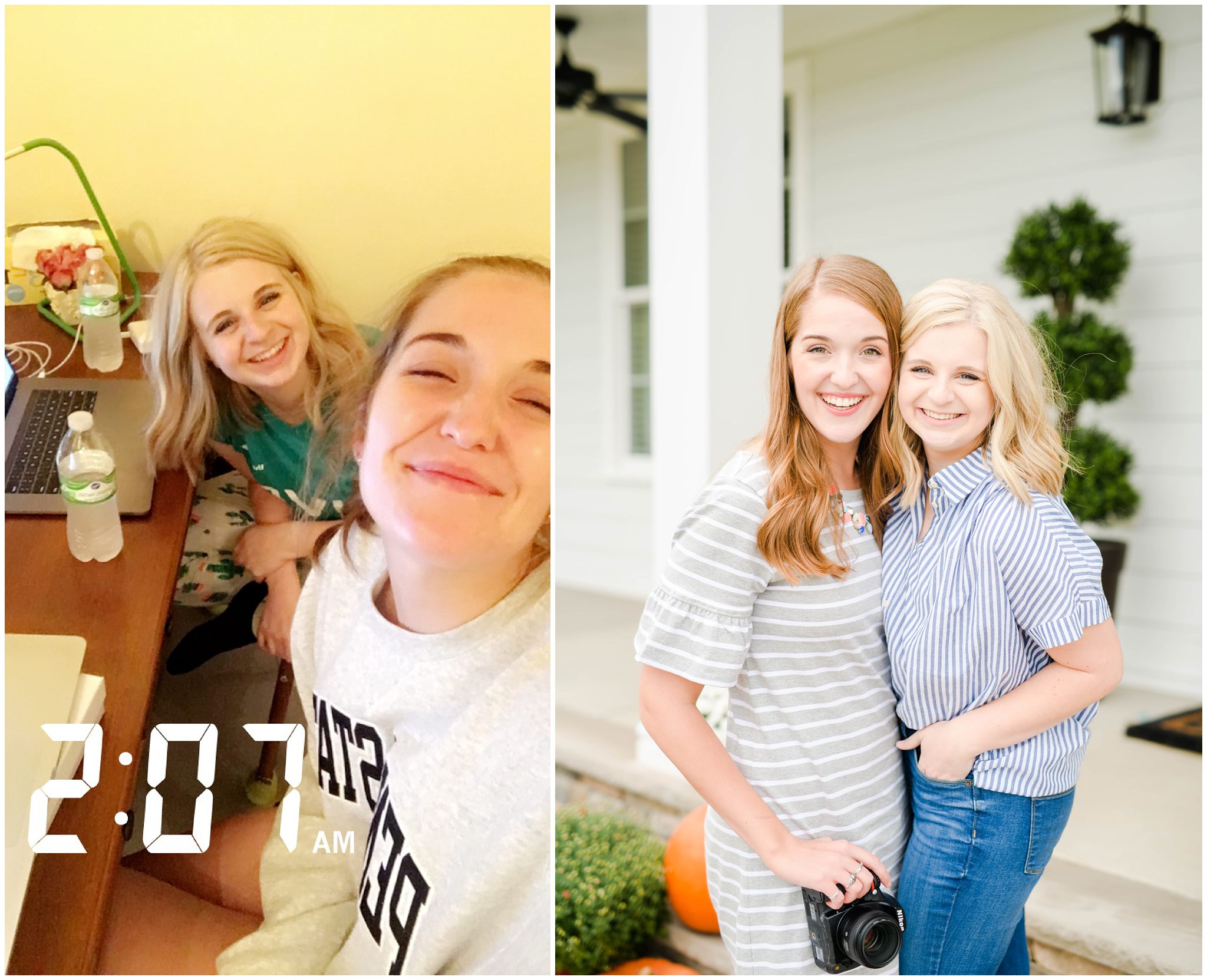
If you don’t know my sweet friend, Rachael, you should! She was such an encouragement in getting me to start the rebrand project! I think the photo on the left was taken the moment I decided to hop onto Showit to make things official! Find her online at: rachaelleighphotos.com
How much did it cost?
I am actually not going to release a specific number here because I know that everyone’s rebrand is different! Giving you a specific number could really open up the comparison game. I don’t want anyone to feel like they have to spend a certain amount of money to have a successful rebrand. I do have to say that the process was an investment that I had saved for throughout 2018. Before you get started with your rebrand, DO YOUR RESEARCH.
Budget and price everything out and remember: you don’t necessarily have to have a custom designer do everything for you! This is a dream of mine someday, but right now, it just wasn’t in the budget. Once I got passed that, everything else fell into place!
Here are a few investments that you may encounter throughout your rebranding process:
- Template or Custom Designer
- Website Building Platform— I used Showit!!
- Domain Hosting
- Giveaway Goodies & Shipping
- Notebook for dreaming and keeping everything organized (Not a necessary expense… I just love stationery)
- A Lawyer (I hired a lawyer to help me reorganize into an LLC! This was by far my biggest investment in the process!)
- Branding Photography to incorporate into your design
- Custom Logo Design (I actually did my logo myself!)
- Collateral materials with your new branding
- Starbucks and Glen’s runs for the days when you just have to take work out of the house
- Personal time for getting everything put together— YES, you should definitely be assigning monetary value to your time! This was also one of the biggest expenses related to the rebrand.
I’m working on rebranding. When did you decide to announce it to get people excited?!
There really is no magic number here! YOU know your audience and also know how frequently you post online! I typically post each week day and some weekends, and tried to incorporate my rebrand into my posts 3-4 times a week after announcing that it was a thing.
I had a bit of marketing eduction in college and learned about the Rule of Seven. In marketing, it is suggested that people need to hear your message at least 7 times before they take action on it. Because I wanted everyone to know about the rebrand, I started early! I definitely used this principle when designing the marketing and social plan behind my rebrand.
I announced my site’s rebranding on November 2 without a confirmed site release date. The site would be done soon, and I also was just dying to share some of the behind the scenes with my audience! Soon after, I announced that the site would go live on November 26th and posted at least a few times a week about the process.
If I can offer any advice, it would be this: Wait to announce your rebrand until you are about 99.9% of the way DONE with your rebranding process. That way, you won’t be totally stressing with everything that needs to be done. It often feels like one step forward and seven steps back as you work through the entire process and it is pretty stressful when you know the clock is ticking!
It may mean sitting on your pretty content for a week or two, but I really do think it would help with stress related to rebranding! I did not do this, and really think that I would do that differently in the future! So… know that this advice is coming from a place of understanding and retrospective thinking.

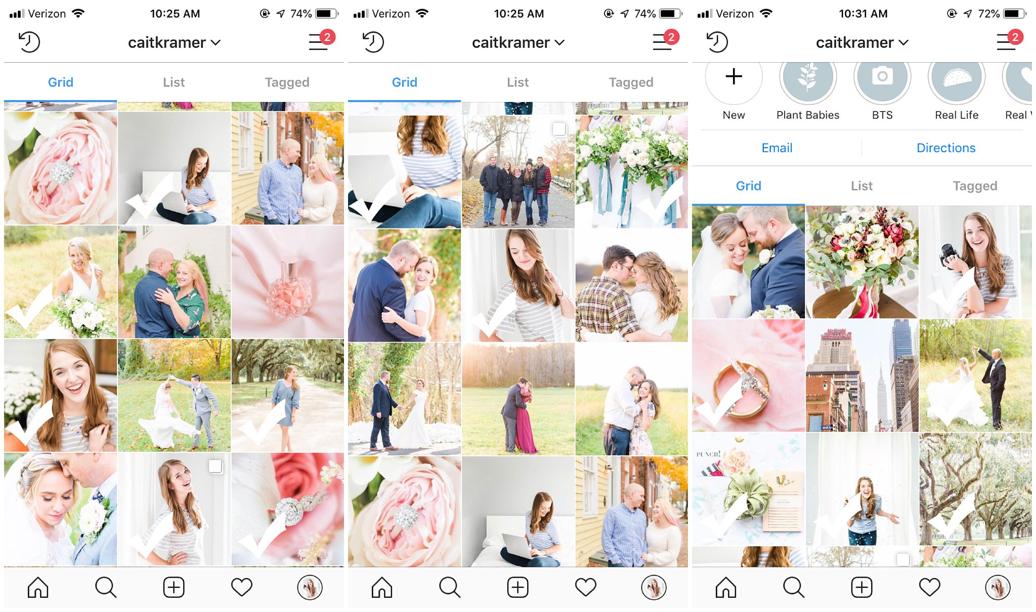
For a little bit of reference: this was my Instagram from November 2 – December 5! The checked posts indicate a post that mention the rebrand! Launch week posts begin at the bottom of the image all the way on the right!
Did other photogs help you? Which people did you use for site inspo?
I did have so much help and encouragement from other photographers! If you know my sweet friend, Savannah, she was a huge encouragement in the entire process. She kept me sane on the days when I felt like I was a crazy person, told me I was crazy when I was actually being crazy, and took almost all of the lifestyle photos of me that you currently see throughout the site! Katelyn James also took quite a few of the headshots you’ll see on the site at her final workshop! I had so much encouragement from others throughout the process and got the feedback from so many of my friends, some of whom are photographers, some of whom are brides and some of whom are not in the biz at all!
When looking around at others’ sites for site inspo, I think the two questions that I found myself asking most was: Why do I love this so much? and How can I make it my own? It is so easy to compare yourself to others, especially throughout the rebrand process! There are a lot of amazing sites out there, but what you have to remember is that your site needs to be true to YOU and YOUR BUSINESS!
Looking at the site of others is a great sounding board for inspiration, but it shouldn’t be the be all end all. You should evaluate the elements that you like and should study why you like them. From there, think about how you can make the elements your own and custom tailored to serve your ideal client best!
It is so important that you are taking YOUR target audience into account. Keep in mind that everyone works within a unique network, so what works for one photographer may not work well for you and vice versa!
Did you design your site or did Showit do it for you?
This is such a great question! (and I always feel like such a tool answering it.) I actually designed most of the site myself! For this rebrand, I purchased a template and then heavily, heavily, heavily customized it myself! I do have a background in designing and customizing sites, mostly because I have done quite a few rebrands for CKP throughout the years! So… I knew just what I was looking for this time around!
I purchased a template from Hearten Creative in the Showit Template Shop and then custom designed it to be exactly how I wanted it to be! (Sending a virtual hug to the person that can guess which exact template I used!!) The best thing about Showit is that customization is totally possible. I could add, subtract, change and keep certain elements throughout the entire site!
If you are considering switching to Showit, you should know just how amazing their support team is! When I couldn’t figure out how to do something, you can bet that their team was there with a solution for me! Their chat box was constantly being blown up with notifications from me. I’m sure they were ready for my site to finally go live!!
What is your favorite part of the site?
I love SO much of the site and that it finally communicates and showcases my work in a way that makes me proud. I am most proud, knowing just how much love and work went into the entire process! To know that current, potential and future clients get to see so much of my heart and portfolio at the click of just a few links means the absolute world to me! I also love that it is SO easy to customize!
BUUUTTTTT… if we are getting super specific, one of my favorite parts of the site is actually in the little stat bar on my About Me page! I love me some Step Counting and Fit Bit-ing, and am so oddly proud of the number of steps I’ve taken during my 2018 season! I have two more weddings to go this season, so stay tuned for the final count! I’ll be updating it as we go 🙂
What was the hardest thing about rebranding?
PHEW. This one is heavy! If you have ever been through the rebranding process, you may know that it is an emotional rollercoaster. (At least it is for me!) In addition to the literal design, you are diving into things that are pretty personal and then have to decide how much you want to share with your audience! What makes you, you? What fuels you each day? Why do you do what you do? That is A LOT! What is important to remember though, is that YOU are the one making the calls. Do what you feel comfortable with and do what inspires you!
There was also a little bit of guilt associated with how much time I was dedicating to the rebrand. I said no to a lot of personal time, time with friends, and time with family. Would I do things differently next time? Yes, most definitely! Would I change anything about my recent rebrand? Nope! It was a huge learning experience that I know I needed to experience!
Now… if I’m being honest, another super hard part of the process was what I call: the comparison monster. I tried my hardest to keep my eyes on my own paper and to design in a way that was true to me! But, at one point, a sweet photog that I follow released HER site! It is so sad to admit, but all I could think was: WOW this site is so beautiful & so functional and mine doesn’t look like that! I really did have to check and evaluate these feelings. What I learned was that it is SO great that our sites didn’t even compare to one another. She serves her amazing group of clients, and I get to serve mine! Our sites aren’t meant to look alike because we are doing our own thing! Sure they look different, but they are both great in their own way!
So…. if you take anything from this post, friend, it is this: You are you and that is good enough! It is okay to learn from others, but do stay true to what you love and believe in! Your site shouldn’t look like someone else’s because, again, you are YOU! Be confident in your truth and let that shine through your design!
If you enjoyed this post, you may also like: